Natalie Dutt Real Estate: A Brand That Feels Like Her
How a new logo and brand board gave a REALTOR® a professional, consistent look across everything, from signs to social media.
The Challenge
For an independent REALTOR®, your name is the brand. Natalie needed an identity that felt like her and could hold its own in a crowded real estate market.
She also needed it to look consistent everywhere clients would see it, from business cards and lawn signs to her online presence.

At a Glance
Client: Natalie Dutt, REALTOR®
Business: Natalie Dutt Real Estate
Industry: Residential real estate
Deliverables: Logo and brand board
Services used: Branding
What We Did
- Discovery into what Natalie wanted her brand to say and how she wanted clients to feel
- A custom logo, including a horizontal lockup in brown and white versions
- A brand board defining her logo versions, colours, fonts and usage rules
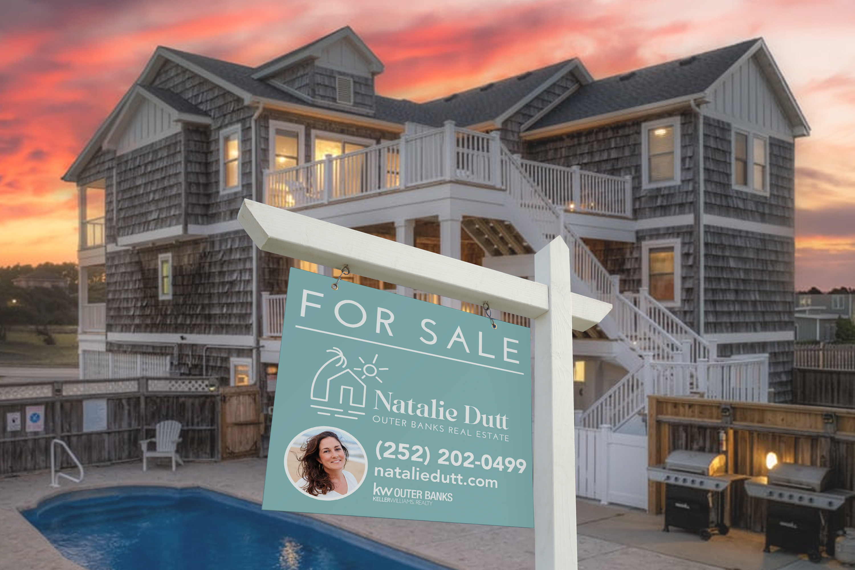
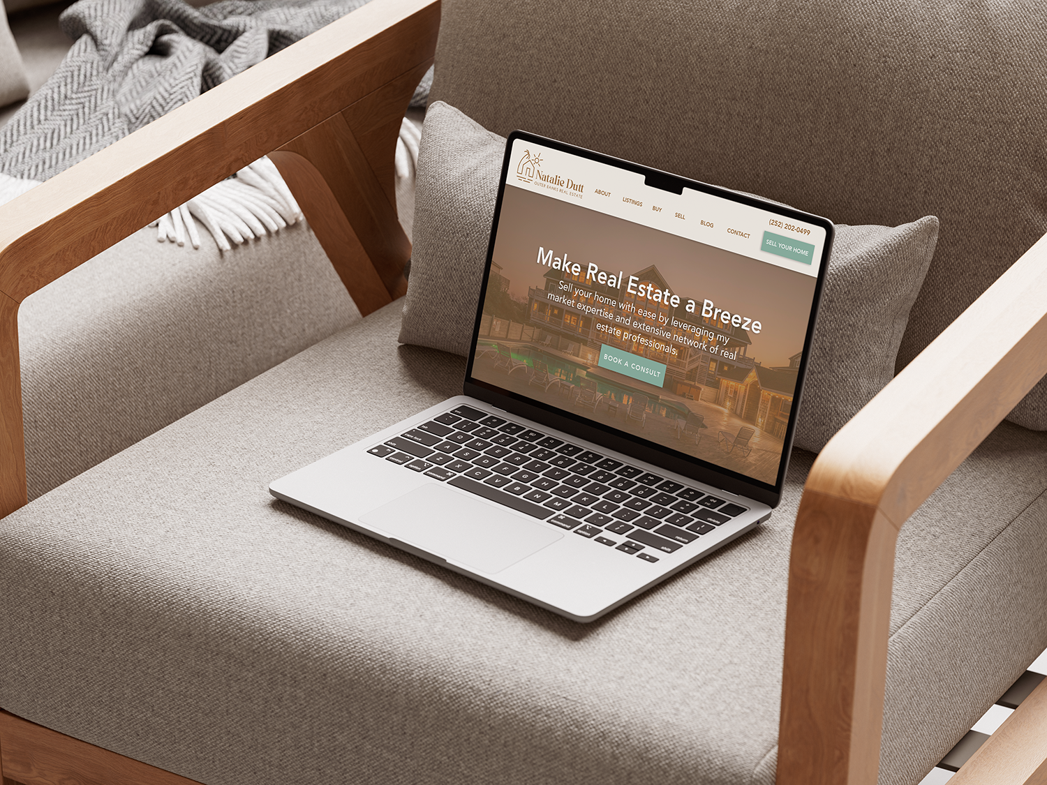
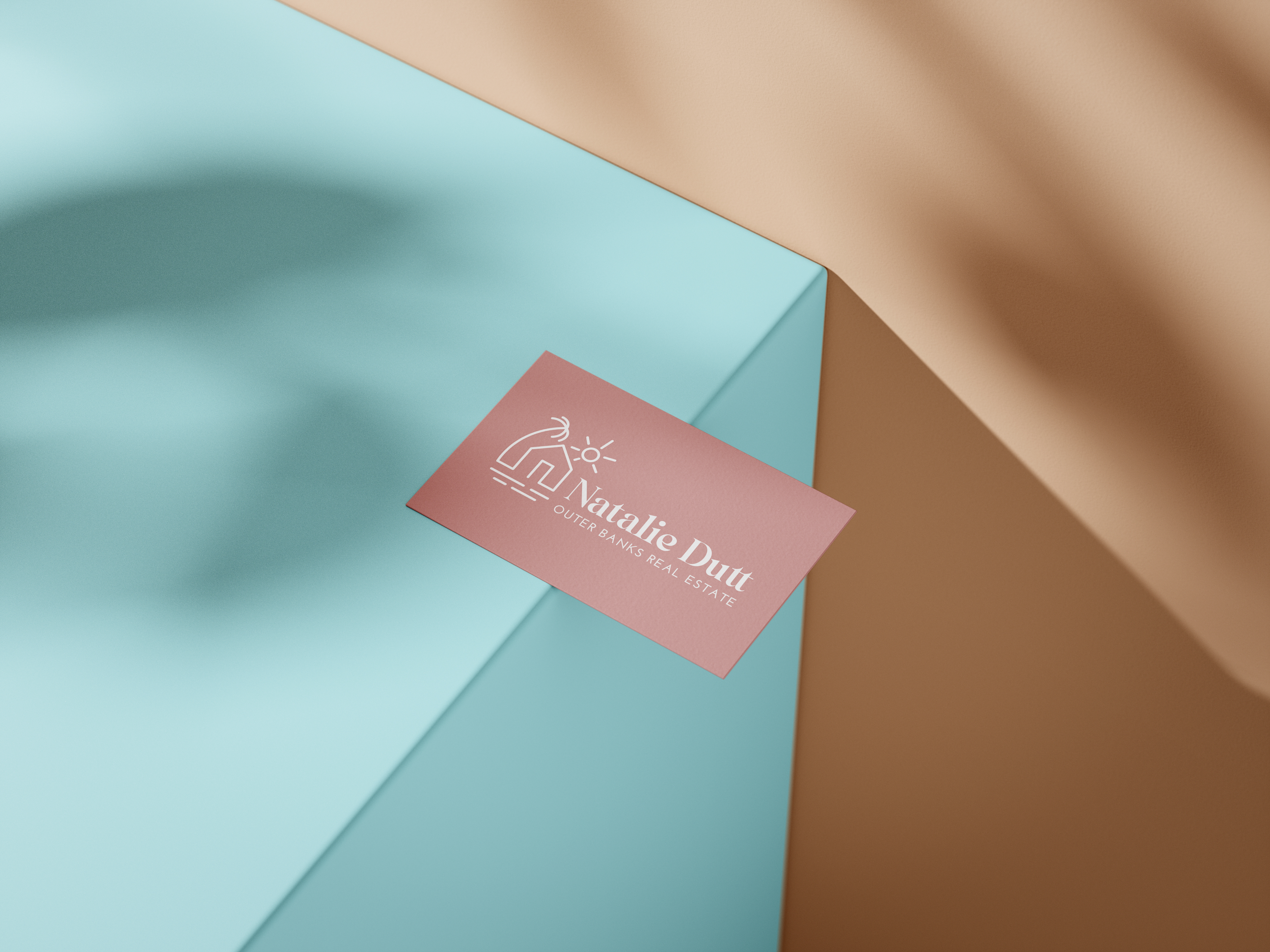
- Mock-ups showing the brand applied to business cards, for-sale signs and digital
The Brand in Action
One consistent look, from the business card to the lawn sign to the website. Click any image to enlarge it.
Business cards
For-sale sign
The brand on screen

The Brand System
01
Logo
A custom mark with horizontal versions in brown and white.
02
Colours
A defined palette so every piece matches.
03
Typography
Fonts chosen to fit the brand's personality.
04
Usage Rules
A one-page brand board so anyone can apply it correctly.
The Result
Natalie now has a professional, consistent look across everything, from signs to social media, and a brand that feels like her.
For independent professionals, that consistency is what makes a name memorable in a crowded market.
What the Client Says
“Jon understood what I wanted my brand to say before I could put it into words. My new logo and brand board give me a professional, consistent look across everything, from signs to social media. I finally have a brand that feels like me and sets me apart in a crowded market.”
Natalie Dutt
REALTOR®, Natalie Dutt Real Estate